Contents
- 1. Increased Focus on Community Mobility
- 2. More Performance Analytics in Economic Development
- 3. Future-Focused Dashboards Drive Long-Term Planning
- 4. Capital Improvement Dashboards: Tracking Infrastructure from Concept to Completion
- 5. Attractive Design: Making Dashboards Clear and Engaging
- The Broader Shift: Dashboards as Everyday Management Tools
Cities and counties are using dashboards to manage complexity, track performance, and communicate progress clearly.
Across North America, local governments are rethinking how they share progress with residents, and the use of public government dashboards has become a big part of that work. They help staff and elected officials organize information, measure outcomes, and make decisions that reflect community goals.
As communities demand more transparency and measurable outcomes, dashboards have become a new language of trust building. They’re becoming a gold standard for how local governments can show the story behind their data: how infrastructure gets built, how funding supports progress, and how strategic goals translate into tangible results.
From rural towns to major metros, the best dashboards balance clarity, design, and performance insight. We are seeing an emphasis on interconnected cities and communities through improved park trails or public transit, for instance, and a greater focus on well-designed data analytics.
We are seeing the use of different dashboard tools—such as Envisio Projects—be used to track major infrastructure initiatives, and greater attention to geospatial map data. We’ve taken a look at our database of leading local governments, for 5 emerging government dashboard trends.
Let’s dive in!
1. Increased Focus on Community Mobility
More cities and counties are using public government dashboards to track investments in public transit, pedestrian access, and cycling infrastructure. The trend points to a larger effort towards one clear outcome: increased community mobility.
We’ve already talked about two of these examples in our Summer outcomes series. In North Grenville, Ontario, they have a Transit Performance Dashboard that tracks ridership and route performance. It shows how even smaller governments can use data to demonstrate how rural transit funding improves access to jobs and education. In Oshkosh, Wisconsin, the city’s Capital Improvement Plan Dashboard tracks park trail upgrades, transit-center improvements, and new “Complete Streets” projects, giving residents a single view of how trail and roadway investments enhance safety and walkability.
But those aren’t the only two! Let’s look more closely at two fast-growing cities in Texas—Cedar Park and Addison—to see how their dashboards show large-scale transportation planning and community design.
The City of Cedar Park, Texas
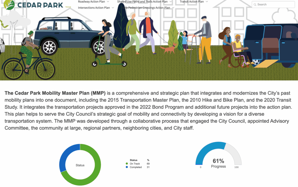
The City of Cedar Park offers one of the most advanced examples of a government dashboard that focuses on community mobility. Their newly published Mobility Master Plan Dashboard combines years of transportation planning into one connected system, linking the city’s Transportation Master Plan, Hike and Bike Plan, and Transit Study.
Cedar Park’s dashboard tracks progress across five key areas: roadways, shared-use trails, transit, intersections, and pedestrian crossings. Each has its own action plan with measurable goals and updates. Residents can see that 69 percent of projects are on track and 31 percent are complete, and they can view project details, timelines, and next steps for each plan component.
The dashboard makes it easy to see how different improvements—such as shared-use trails, micro-transit pilot routes, or new crossings—work together to improve access and safety. Trail projects link parks and schools, intersection redesigns support “Complete Streets” goals, and transit upgrades explore on-demand service in growing neighborhoods. The city can now track how each piece contributes to the overall mobility network.
The Town of Addison, Texas
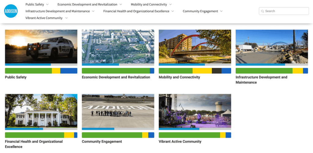
Another Texas town—the Town of Addison—is also using its dashboard to support pedestrian safety and connectivity. Through its updated Master Transportation Plan, staff introduced a Pedestrian and Bicycle Toolbox that identifies priority crossings, lighting upgrades, and intersection improvements. Recent projects have added lighting to trail crossings, improved sight lines at intersections, and secured Highway Safety Improvement Program funding for major signal upgrades.
Addison’s dashboard gives residents a clear view of where projects are taking place and how community feedback from public meetings is influencing design choices. Residents can see progress on an interactive map and understand how small, consistent improvements add up to a safer, more walkable town.
Government dashboard trend takeaway # 1: Mobility matters
These dashboards help promote access and mobility in a community. What’s more, they help show external funding bodies (both private and public) understand the geographic layout and longer-term ambitions of a community. Connected cities are healthier, less lonely, and have better opportunities for employment.
The fact that we are seeing public transit dashboards and mobility dashboards, as well as pedestrian pathway efforts, pop up as strategic pillars, signifies a greater trend of visibility into efforts toward greater connectivity.
2. More Performance Analytics in Economic Development
Economic development has always been a major priority for local governments, but the ways it has been talked about are shifting, particularly after COVID-19. Economic uncertainty and volatility have required greater efforts at transparency from local governments.
It’s not uncommon to see market indicators in dashboards, such as vacancy rates or assessed values, alongside social indicators, like affordability and job creation. These measures give a balanced view of growth that goes beyond single metrics like GDP or tax revenue.
An emphasis on analytics around economic development is a practice that we hope to see more of! While an economic development focus has long been a priority for local governments, communicating those efforts to residents and potential investors is a popular way to use a government dashboard.
Leveraging performance measurement also helps the economic development portions of a dashboard serve as a management tool, as much as a communication tool. Staff can monitor which programs deliver results, where economic activity is slowing, and how to adjust policy. The public can see evidence of progress, which builds trust and encourages participation.
City of Gaithersburg, Maryland
The City of Gaithersburg tracks different outcome areas. Their Economic Development and Redevelopment area combines data from across departments, and displays clear analytics and charts.
They visually track building permits, housing approvals, commercial vacancy, hotel occupancy, unemployment rates, and grant activity. Each chart tells part of a larger story about the city’s economic health. One example is their “Building Permits Finaled” performance measure, which tracks annual permit activity. This performance view helps Gaithersburg track shifting development patterns and prepare for the next wave of major projects.
Government dashboard trend takeaway #2: Clarity through economic analytics
Economic development dashboards help governments understand local resilience. They track how jobs, housing, and investment interact, and they make that information visible to everyone who depends on it.
3. Future-Focused Dashboards Drive Long-Term Planning
Local governments have to balance thinking in decades as well as budget cycles. Government dashboards are helping them do it by bringing transparency to long-term planning. Showing how elements like population growth, infrastructure investment, and land use change over time, is a great way to build trust and forward momentum. They also help communities stay organized while meeting state or regional planning requirements… and requirement changes.
Instead of burying data in thick comprehensive plans, cities are putting their goals and progress right where residents can see them. A good long-term planning dashboard connects the dots between elements—from housing capacity to stormwater upgrades. It helps staff stay organized, supports grant and funding requirements, and builds public trust by showing how every project contributes to a bigger picture.
Sedro-Woolley, Washington
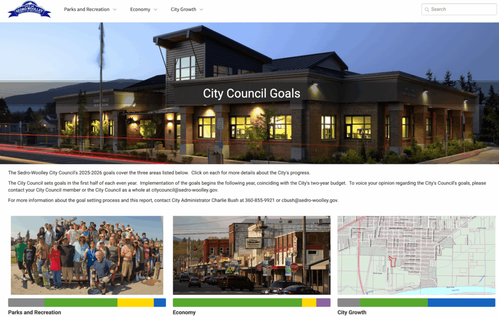
Sedro-Woolley created a Comprehensive Plan Dashboard to track their 2025-2026 plans, but those plans contain embedded information about population forecasts, land capacity, and urban growth boundaries.
Their dashboard also lists key infrastructure projects, such as corridor improvements and intersection upgrades, with details about budgets, expenditures, and project phases.
Government dashboard trend takeaway #3: Long live long term!
Growth and infrastructure dashboards give communities a clear way to track long-term planning goals. They align population projections, capital projects, and budgets so leaders and residents can see progress toward shared targets.
4. Capital Improvement Dashboards: Tracking Infrastructure from Concept to Completion
As cities and counties plan and deliver large-scale infrastructure projects, capital improvement dashboards have become essential tools for managing execution. These government dashboards help leaders see how time, budget, and staffing align with approved capital plans. They bring order to complex portfolios of roads, parks, facilities, and utility projects by turning planning data into a real-time management system.
Rather than only reporting completed work, capital improvement dashboards help answer practical questions:
- Which projects are on schedule and within budget?
- Where are there delays?
- Are resources being allocated effectively across departments?
This visibility helps governments stay on top of delivery while giving residents a clear view of how investments are progressing.
By presenting progress visually, these dashboards create predictability and build public confidence. They show that each milestone—design, construction, or close-out—is tracked, documented, and reported consistently.
City of St. Helena, California
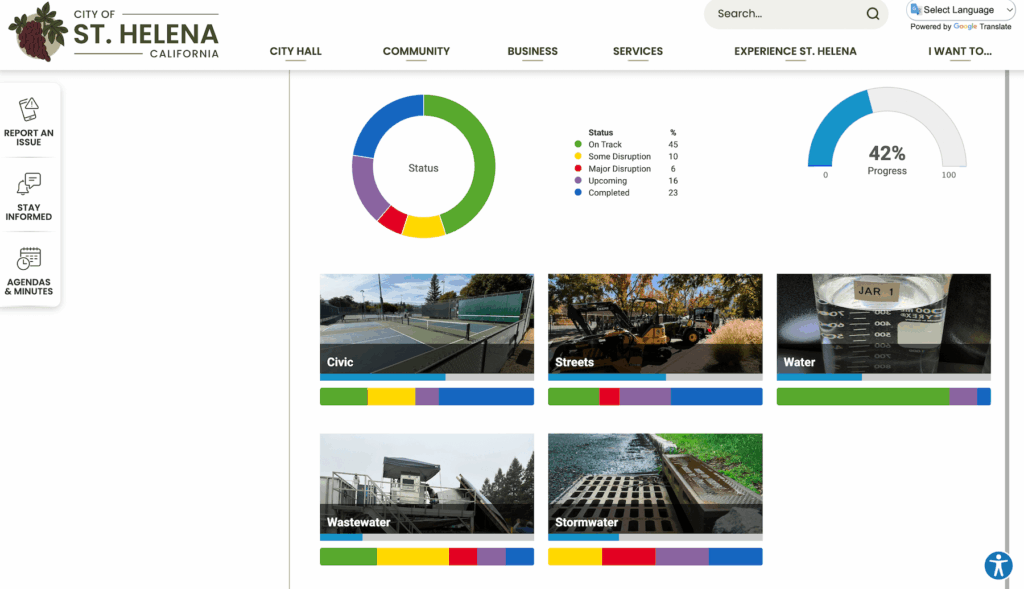
The City of St. Helena shows how a smaller municipality can use a government dashboard to bring structure and transparency to an ambitious public works program. Through its Envisio-powered Capital Improvement Program (CIP) Dashboard, St. Helena tracks progress on a five-year, $66.2 million portfolio that includes more than 100 public works projects—from street resurfacing and ADA ramp upgrades to major water-system and wastewater improvements.
The City Council adopted its new five-year Capital Improvement Plan in May 2025, setting a multi-year funding strategy that coordinates bond issuances, grants, and enterprise funds across fiscal years 2026–2030. The dashboard helps staff balance that complexity, showing which projects are in design, which are under construction, and which depend on future funding tranches or permits.
For public works and finance staff, the CIP Dashboard functions as both a management tool and a communication channel. Every project page includes budget and expenditure data, current phase, and a visual progress bar, allowing department heads to monitor delivery and council members to discuss funding realities with confidence. For residents, it serves as a public record of how infrastructure dollars are being used.
El Paso County, Texas
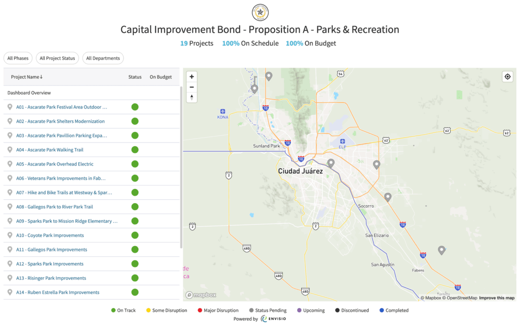
El Paso County, Texas, uses a Capital Improvement Dashboard to manage its voter-approved bond projects. Each initiative—ranging from park improvements to new animal care and medical examiner facilities—is tracked for schedule and budget adherence. The dashboard lists the phase of each project, percentage of completion, and funding spent to date.
For program managers, this dashboard functions as both a reporting and workload management tool. It provides an overview of all active projects, helping staff balance timelines, anticipate resource needs, and maintain momentum across departments. For residents, it offers transparency into how bond dollars are being invested and when they can expect new facilities to open.
Government dashboard trend takeaway #4: Dashboards are great for Capital Improvement Plans
Capital improvement dashboards help governments manage infrastructure delivery with clarity and accountability. They align teams around project timelines, monitor spending in real time, and keep the public informed about how community investments are being built.
5. Attractive Design: Making Dashboards Clear and Engaging
Good, accessible design and user experience are being seen more and more as a form of service delivery. A well-structured dashboard allows anyone to see how public money turns into visible outcomes—roads built, shelters opened, and grants awarded. Cities are learning that good visual communication determines whether residents actually use the dashboards provided to them.
Across many Envisio customers, the design improvements share common traits:
- Consistent color coding and icon sets.
- Clear text labels for every chart and figure.
- Language that focuses on actions and results.
- Logical navigation that allows users to move from a summary view to project-specific details.
-
Accessibility features such as high-contrast color options and readable fonts.
City of San Leandro, California
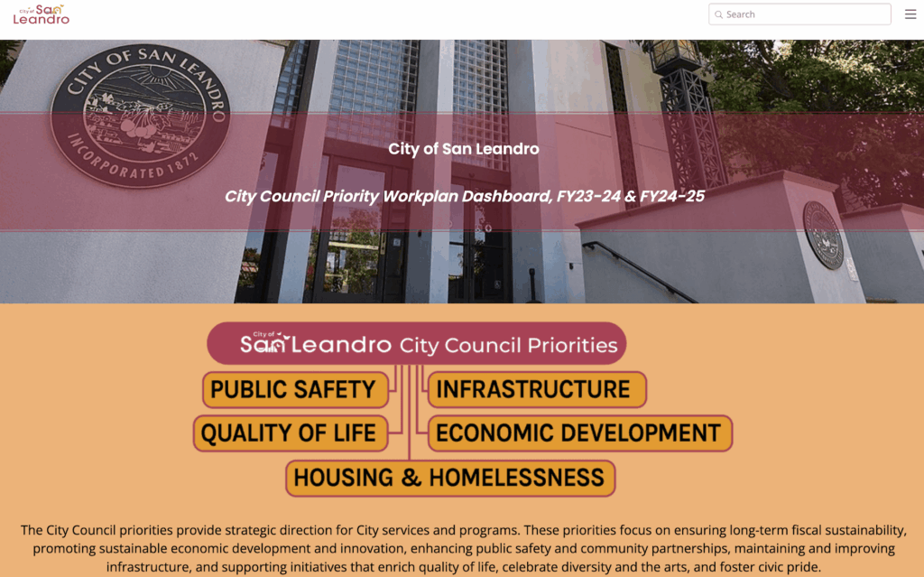
San Leandro’s City Council Priority Dashboard shows how strong visual design can make performance data easy to follow. Organized under five clear priorities—Infrastructure, Public Safety, Housing and Homelessness, Economic Development, and Quality of Life—the dashboard cascades information from council goals to projects and deliverables in a logical flow.
A brief “Understanding the Numbers” section helps users interpret the visuals, while color-coded charts and a progress gauge summarize results. As of August 2025, 65% of deliverables are complete, 30% are on track, and 5% are delayed, representing about 75% overall progress.
Their design choices show their individuality while still serving clarity. Consistent colors, clean typography, and clear navigation guide users through summaries to detailed project data. The result is a well-structured, accessible government dashboard that reflects both progress and accountability—turning policy priorities into an easy, engaging visual story of city performance.
City of Minnetonka, Minnesota
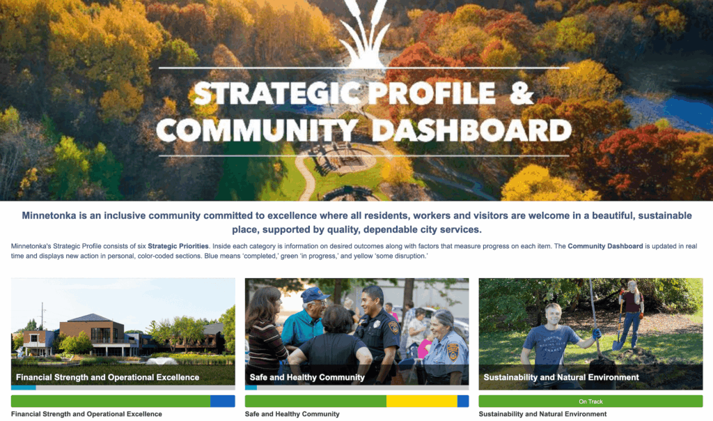
The City of Minnetonka’s Community Dashboard is a standout example of clear design in government performance reporting. Managed by the Communications and Marketing team, the dashboard translates complex strategic data into an experience that residents can easily explore and understand.
Organized around six strategic pillars, twenty-four key strategies, and over ninety action steps, the layout mirrors the city’s Strategic Profile—showing how long-term goals connect to measurable outcomes. Visitors can drill from broad priorities into project-level progress, with quarterly updates that combine performance metrics, traffic-light indicators, and staff-written narratives.
Design consistency makes the dashboard intuitive: a clear hierarchy, thoughtful color coding, and simple icons guide readers through the information. Minnetonka’s dashboard is accessible in more than twenty languages and prominently featured on the city’s website, signaling transparency and inclusion.
Regular staff engagement keeps the dashboard current and accurate, ensuring it remains a living reflection of Minnetonka’s strategic progress. Among all Envisio-powered government dashboards, Minnetonka’s consistently ranks among the most visited—proof that good design drives trust, clarity, and connection with the community.
Government dashboard trend takeaway #5: good design is a public service
Local governments that use public dashboards are treating design as a form of public service. Well-structured, visually consistent dashboards make complex information easy to understand, helping residents see where progress is happening and how priorities are funded.
The Broader Shift: Dashboards as Everyday Management Tools
Across all these examples, a clear pattern emerges: dashboards are no longer just reporting tools. They have become part of the daily operational fabric of local government.
Staff use them to monitor progress, identify roadblocks, and coordinate work across departments. Council and community members use them to see the same information in real time and understand how decisions translate into outcomes.
What we’re seeing—from Cedar Park’s mobility tracking, to Gaithersburg’s economic indicators, to Sedro-Woolley’s long-term planning, to St. Helena’s capital program management, to Minnetonka’s design-forward storytelling—is a shared shift toward more transparent, data-informed public service. Dashboards help leaders connect infrastructure to investment, planning to performance, and community priorities to measurable results.
The best government dashboards now serve three audiences at once:
- Staff who need clarity,
- Leaders who need visibility,
- And residents who expect transparency.
They support communication, reinforce accountability, and make complex information accessible.
Dashboards have become the connective tissue of modern local government—a shared reference point where plans, projects, and performance meet, and a practical tool for building trust through clear, consistent storytelling about progress.
