Contents
Summary
These 9 local government and public sector examples show how cities, counties, and organizations use public-facing performance analytics dashboards to turn operational data into strategic insight — and strategic insight into community trust.
In this post:
- 9 real examples of public-facing performance analytics dashboards from cities, counties, and public sector organizations
- How governments are turning operational data into strategic insight
- What the best dashboards have in common — and what makes them work
- How making performance data public builds community trust
Performance analytics dashboards are one of the most powerful tools available to local governments today.
When done well, KPI dashboard software transforms raw operational data — response times, permit volumes, water production, vacancy rates, library circulation — into actionable insight that helps organizations allocate resources wisely, course-correct early, and demonstrate real value to the communities they serve.
And when that data is made publicly available, something else happens:
Residents gain a window into the work their city is doing on their behalf — the response times, the housing placements, the miles of road overlaid, the programs delivered.
Governments gain a meaningful way to show up consistently and credibly for the people they serve.
That combination of rigorous internal analytics made visible to the public is what transforms a performance measurement dashboard from a reporting tool into a foundation for building trust.
That said, many organizations struggle to know where to start.
- What should you measure?
- How do you connect day-to-day operational metrics to your strategic plan?
- How do you present performance data to residents in a way that’s honest and accessible without being overwhelming?
In this post, we share 9 real-world examples of public-facing performance analytics dashboards — from fast-growing cities and small municipalities to a county and a public library system — and break down what makes each one worth learning from.
Performance analytics dashboards look different depending on an organization’s size, maturity, and strategic priorities. Some cities track dozens of departmental KPIs across water, fire, finance, and economic development. Others have narrowed their focus to three community-defined priorities and a handful of outcome measures. Some performance measurement dashboards are built for a general public audience; others serve as a real-time scorecard for elected officials and department heads.
What matters across all of them is the same: metrics that are meaningful, data that is current, and a clear connection to strategy. We hope these examples inspire you as you build or strengthen your own KPI and performance measurement dashboard implementation. Let’s dive in!
1. City of Buckeye, AZ
Community size – approx. 105,000 residents
Types of KPIs Measured: Economic development workload indicators, water production and treatment, HR and safety training, IT work order resolution, utility billing, fire response times, and more
- Economic and Development Workload Indicators: Measures the volume of tasks or amount of effort required to achieve an outcome.
- Water Resources: Daily production and treatment volume in gallons, lost and unaccounted water, and reduction rates
- Human Resources: Personnel position control and safety training
- Information Technology: Work order resolution and security scores
- Finance: Utility billing customer service, method of pay to vendors, and procurement workload
- Fire: Emergency response time components at the 90th percentile for front-line engine companies, and automatic aid statistics
The second dashboard, Citywide KPIs by Strategic Plan Focus Area, reorganizes that same operational data through the lens of Buckeye’s 2025–2028 Strategic Plan priorities:
- Fiscal Responsibility
- Economic Growth
- Innovative and High Performing
- Organization
- Safe and Sustainable Quality of Life
- Infrastructure
why we love it
Dual dashboard power! The two dashboards reflect a thoughtful approach to performance analytics: operational detail for those who want it, strategic context for those who need it.
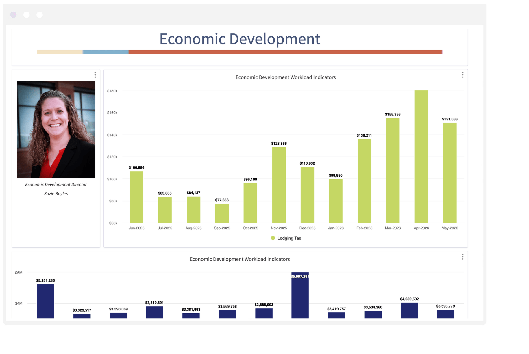
2. City of Surprise, AZ
Community size: Approx. 156,000 residents
Types of KPIs Measured: Fire-medical response, cardiac survival, police calls for service, business permits, tourism tax revenue, recreation participation
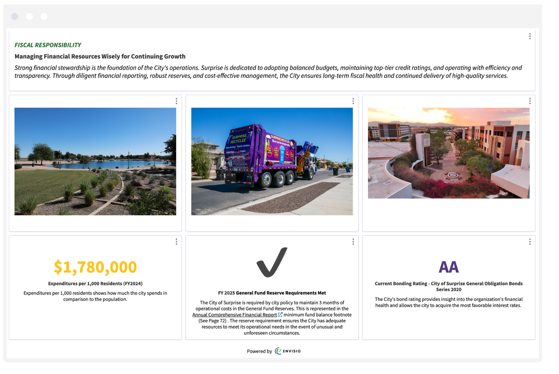
Surprise’s performance dashboard ecosystem spans eight Envisio-powered public-facing dashboards, each aligned with a priority area from the City Council Strategic Plan — covering everything from fire-medical response and cardiac survival rates to water conservation, transportation infrastructure, and fiscal stewardship.
The eight dashboards are:
- Community Experience: Amenities, parks, recreation, cultural programming, and sports tourism
- Economic Development: Business attraction and retention, workforce development, and economic resilience
- Fiscal Responsibility: Budget performance, credit ratings, financial reserves, and cost-effective service delivery
- Government Transparency: Public engagement, digital accessibility, and data-driven decision-making
- Public Safety: Hiring, training, emergency preparedness, and neighborhood safety
- Transportation: Corridor improvements, regional access, and multimodal safety
- Valley Benchmark Communities Trend Report: Comparative demographic, financial, and performance data across Arizona local governments
- Water: Water sourcing, conservation, infrastructure investment, and long-term resilience planning
Why we love it
Seeing all of their dashboards together drives home their emphasis on including context alongside the metrics. The City of Surprise does a good job explaining what the metrics measure and why they matter — supporting both internal accountability and external transparency with residents.
3. City of Irving, TX
Community size: 256,000 residents
Types of KPIs Measured: Infrastructure investment, economic vitality, community satisfaction, government sustainability, public safety, resident survey results
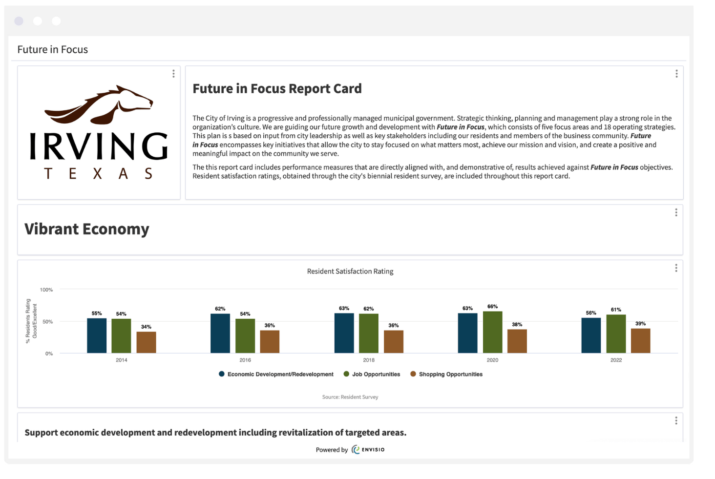
Irving’s Future in Focus is a city-wide organizational strategy — and its performance analytics dashboard ecosystem is built to match that ambition.
Rather than a single dashboard, Irving offers multiple public-facing dashboards, all organized around five strategic focus areas and 18 operating strategies built from input from City Council, city leadership, residents, and the business community.
The Future in Focus Strategy Dashboard tracks initiative progress across five strategic pillars:
- Vibrant Economy: Business retention and recruitment, land use planning, commercial taxable value, occupancy rates, and marketing Irving as a destination
- Infrastructure Investment: Roadway maintenance, water and wastewater infrastructure, capital projects completed on schedule and within budget, and miles of street overlay
- Sense of Community: Recreational, cultural and educational opportunities, community engagement, diversity and inclusion
- Government Sustainability: Financial integrity, workforce development, government efficiency, and transparency
- Safe and Beautiful City: Public safety and security, property conditions, and environmental stewardship
why we love it
What makes Irving’s performance measurement dashboard particularly compelling is the depth of its infrastructure tracking. Their performance dashboard surfaces many wins, such as a multi-year Summer Asphalt Overlay Map, resident satisfaction ratings for major streets, neighborhood streets, and overall street maintenance going back to 2014.
4. City of Corona, CA
Community size: 161,000 residents
Types of KPIs measured: Community engagement, economic development, homelessness, public safety, utilities, resident service requests
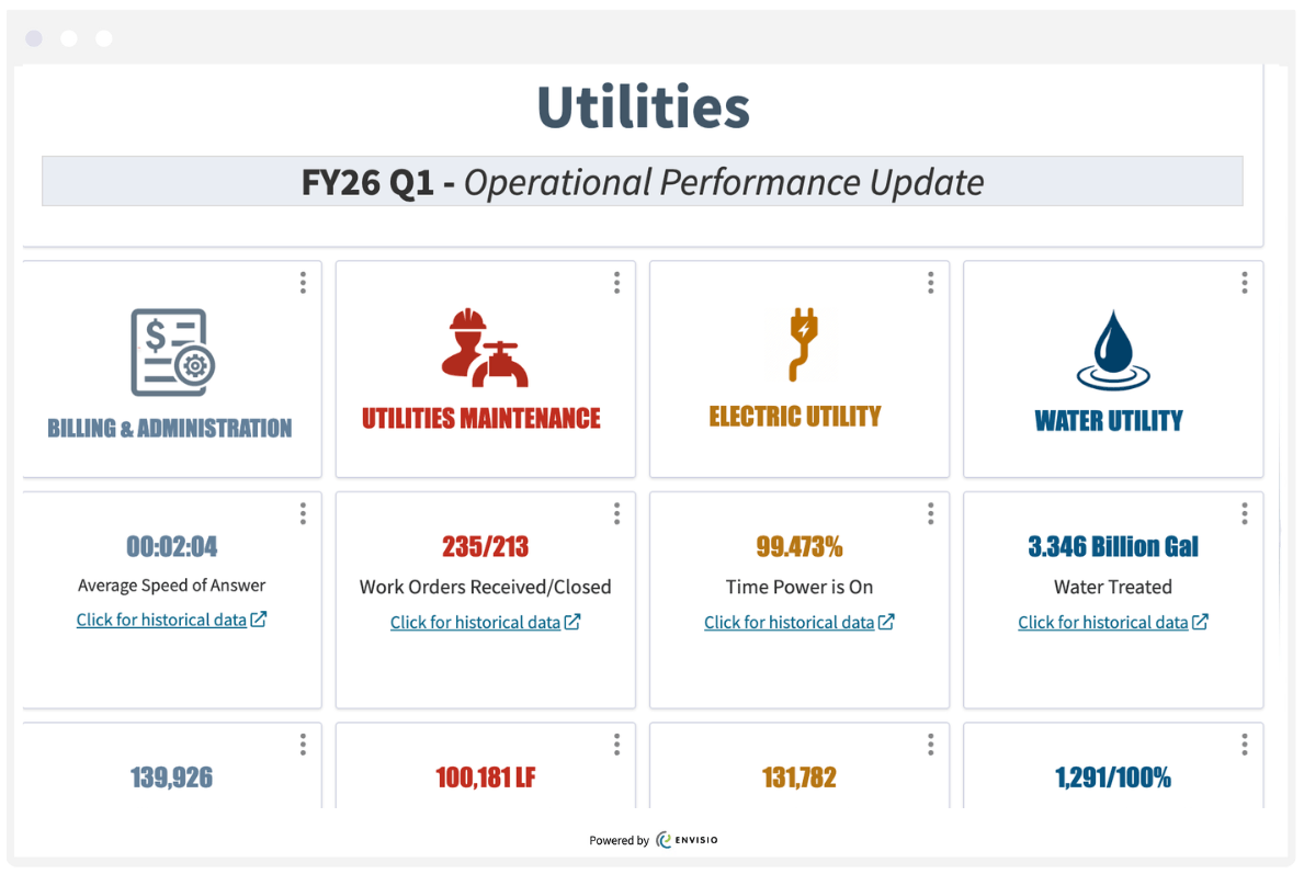
Beneath the City of Corona’s 2021–2026 Strategic Plan dashboard sits a full suite of quarterly Department KPI Dashboards covering nine operational areas, updated every fiscal quarter and each linking to historical trend data.
The FY26 Q1 data surfaces some compelling measures. We’ve shown the utilities On the economic development side, Corona tracks not just new businesses (278) but businesses retained (1,665) and businesses actively assisted and promoted (107) — a more honest picture of economic health than business attraction numbers alone. The homelessness performance report tracks the full service continuum, from street outreach contacts through to permanent housing placements. Public safety data includes average fire response time (00:04:49) and Priority 1 police response rate at 5 minutes or less (57%).
The Utilities report, for instance, covers four service areas — Billing & Administration, Utilities Maintenance, Electric Utility, and Water Utility — with metrics that give residents a window into present and historical data:
- Electric uptime: 99.473%
- 3.346 billion gallons of water treated; 0.964 billion gallons of wastewater treated
- 1,291 water samples at 100% compliance
- 100,181 linear feet of CCTV inspected; 112,197 linear feet of sewer mains cleaned
- Average customer service answer time: 00:02:04
- 235 utility maintenance work orders received / 213 closed
why we love it
We really love the inclusion of historical data. Including historical information helps turn what could be a static quarterly report into a genuine performance analytics dashboard that builds credibility over time.
5. City of West Hollywood, CA
Community size: 35,000 residents
Types of KPIs Measured: Commercial vacancy rates, market rates by district, visitation, unemployment, sales tax by industry sector, hotel occupancy and average daily rate
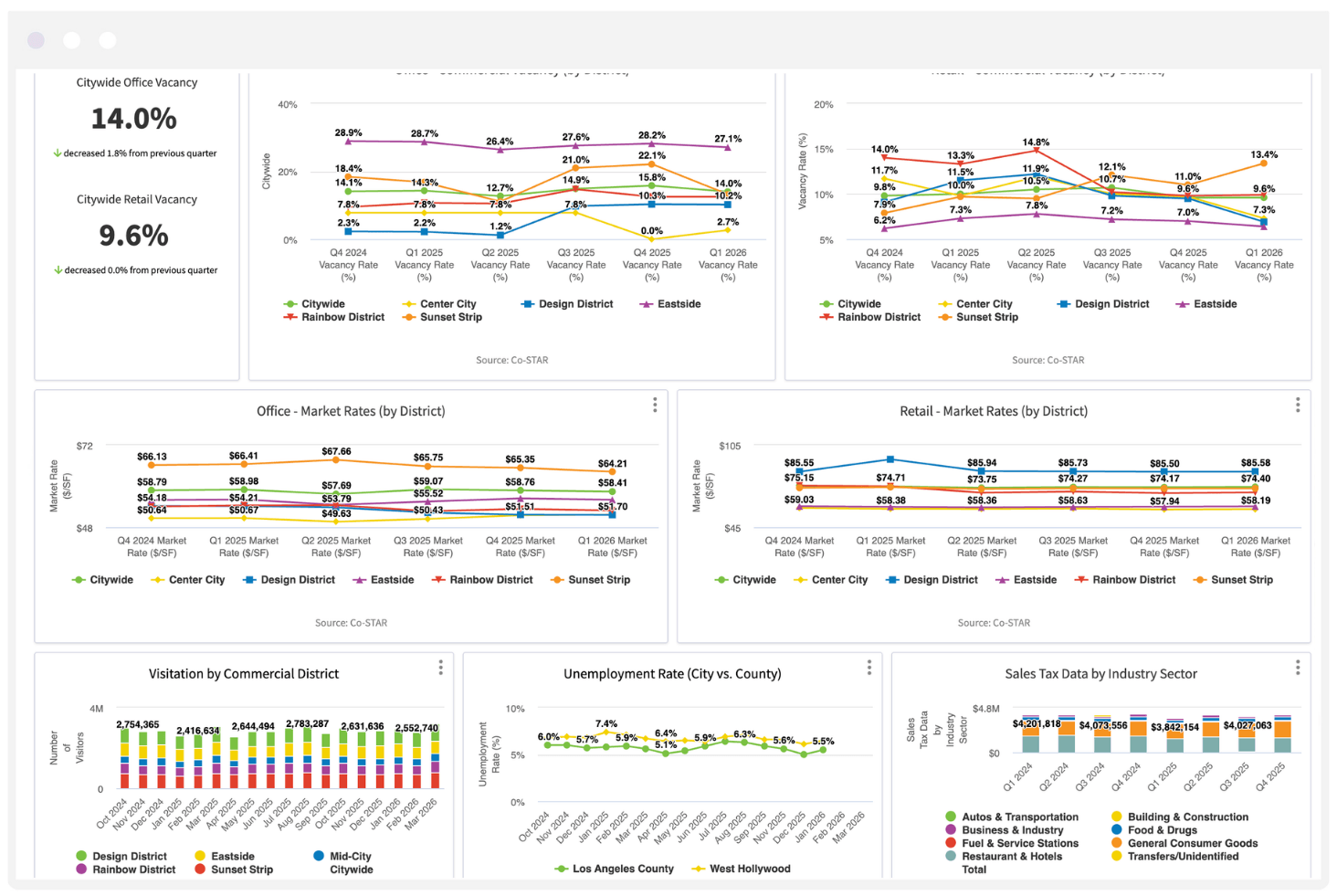
West Hollywood’s Economic Data Dashboard has a data-rich approach to tracking the city’s commercial health, and is one of the most analytically sophisticated economic dashboards on this list.
Updated quarterly through Envisio, the dashboard gives businesses, developers, and city leaders a real-time pulse on market conditions across WeHo’s distinct commercial districts.
Commercial Real Estate metrics break down vacancy and market rates by district — Center City, Design District, Eastside, Rainbow District, and Sunset Strip — tracked quarterly from Q4 2024 through Q1 2026:
- Citywide office vacancy: 14.0% (↓1.8% from previous quarter)
- Citywide retail vacancy: 9.6% (stable quarter-over-quarter)
- Office market rates ranging from ~$51–$58/SF depending on district
- Retail market rates ranging from ~$58–$86/SF depending on district
Visitation tracks foot traffic by commercial district monthly (sourced from Placer.ai), with citywide totals ranging from roughly 2.4M to 2.8M visitors per month across the Design District, Eastside, Mid-City, Rainbow District, and Sunset Strip.
Labor Market compares West Hollywood’s unemployment rate against Los Angeles County month-over-month — currently 5.5% for WeHo versus 7.4% at the county level at peak.
Sales Tax Revenue breaks down quarterly sales tax data by industry sector including Restaurants & Hotels, Food & Drugs, Autos & Transportation, Building & Construction, Business & Industry, Fuel & Service Stations, and General Consumer Goods — with quarterly totals ranging from approximately $3.8M to $4.8M.
Hotel Performance tracks two key hospitality metrics monthly across 18 reporting properties:
- Hotel occupancy rate (ranging from a low of 45.3% in January 2025 to a high of 81.7% in October 2024)
- Hotel average daily rate (ADR), ranging from $331 to $404
why we love it
What distinguishes West Hollywood’s dashboard is its district-level granularity and its multi-source data integration — making it as useful for a commercial broker evaluating a specific corridor as it is for a city official tracking overall economic health. For a community whose economy runs on retail, hospitality, and tourism, these are exactly the right metrics to be watching.
6. The City of Las Cruces, NM
Community size: Approx. 115,000 residents
Types of KPIs Measured: Community prosperity, capital improvements, infrastructure, environmental sustainability, parks access, attainable housing, active transportation, land use, economic development, public safety, mobility, historic preservation, human services
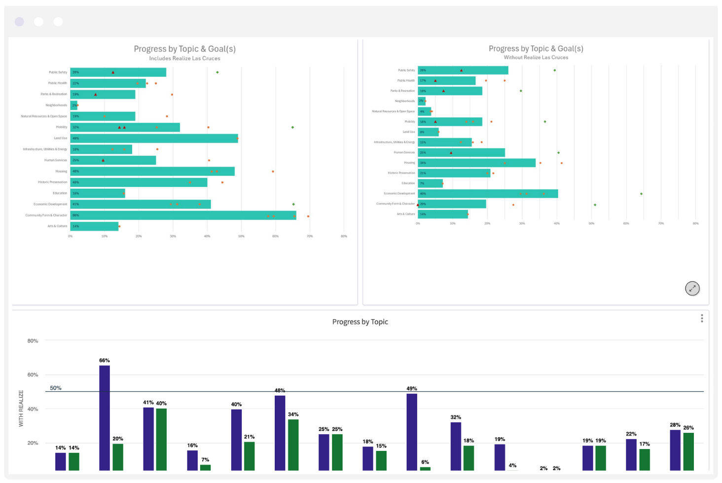
Las Cruces has a lot of analytical depth behind its public dashboard.
That analytics layer breaks down goal completion rates across 15 topic areas, including:
- Community Form & Character: 66% progress
- Land Use: 49%
- Housing: 48%
- Economic Development: 41%
- Historic Preservation: 40%
- Human Services: 25%
- Public Safety: 28%
- Mobility: 32%
- Parks & Recreation: 19%
- Arts & Culture: 14%
Why we love it
The dashboard distinguishes between progress with and without the Realize Las Cruces goals — a separate planning initiative where all goals are credited at 75% completion — making it easy to see where genuine on-the-ground progress is happening versus where numbers are buoyed by a single project.
Individual goals are further flagged as outliers: red triangles for goals at 50% or below overall progress, green diamonds for goals at 150% or above, and orange circles for everything in between.
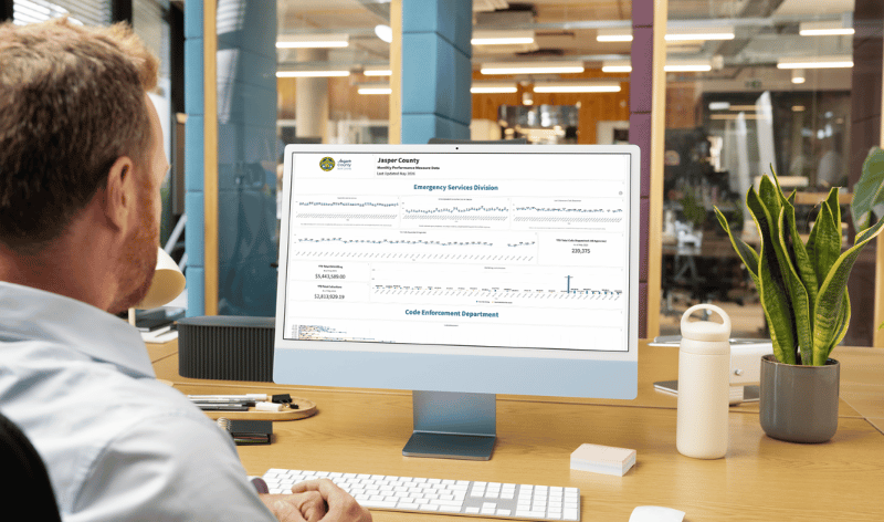
7. Jasper County, SC
Community size: Approx 40,000 residents
Types of KPIs Measured: Emergency services, law enforcement, GIS, parks and recreation, building permits, business licenses, tax revenue, IT infrastructure
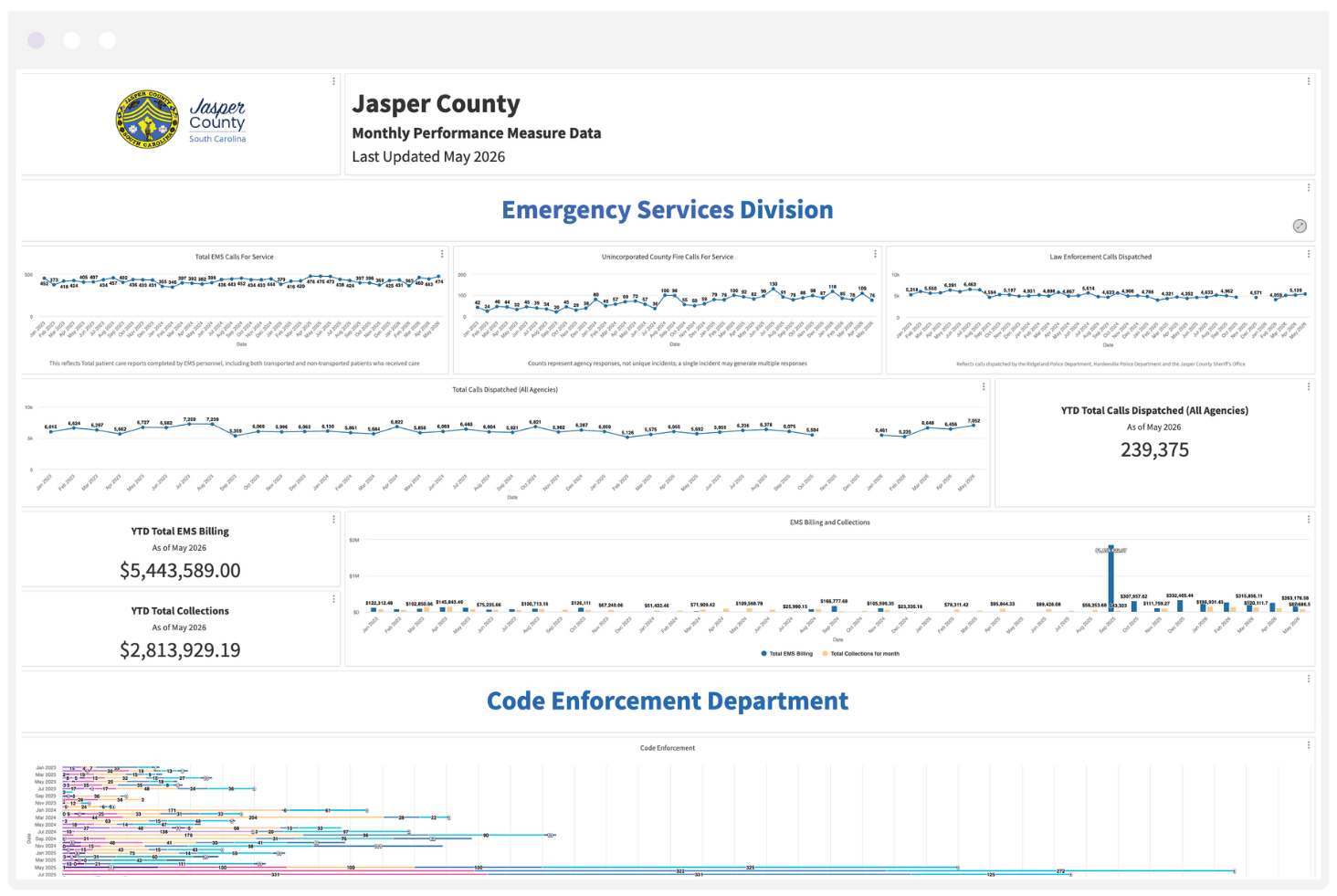
Jasper County is the fastest growing county in the United States. Their Monthly Performance Measure Dashboard is extremely detailed. Updated monthly through Envisio, the dashboard spans multiple departments and tracks a wide range of metrics that collectively paint a picture of a county managing explosive growth in real time.
Key performance measures across departments include:
- Emergency Services: Total EMS calls for service (~430/month), unincorporated county fire calls, law enforcement calls dispatched across three agencies, and total calls dispatched countywide (232,323 YTD as of May 2026)
- GIS: E-911 new addresses issued, addresses verified, stolen road signs, and current project statuses
- Parks & Recreation: Monthly event attendees across six community centers plus Sgt. Jasper Park (221,906 YTD as of May 2026)
- Building Permits: Monthly permits by type — residential improvements, commercial improvements, new single family, new multi-family, mobile homes, new commercial, and more
- Business License: New and renewed licenses, business license revenue, and local accommodation and hospitality tax revenue
- IT: Work order tickets, and a standout cost-avoidance metric — YTD labor cost if a contractor had been hired ($3,150,735) versus actual project labor cost ($15,160,400) — plus a live status tracker for over 40 active IT projects ranging from cybersecurity programs to camera installations and network upgrades
Why we love it
That IT cost-avoidance framing is a particularly smart analytics choice, translating departmental workload into a dollar figure. It’s something we love about their dashbaord in general: the effort to make value immediately legible to elected officials and residents.
For a county of under 40,000 residents, the depth and consistency of Jasper County’s dashboard is impressive; a direct reflection of the reality that comes with being the fastest-growing county in the nation.
8. City of Celina, TX
Community size: Approx. 75,000 residents
Types of KPIs Measured: Development services, public works infrastructure, human resources, marketing and communications, public safety
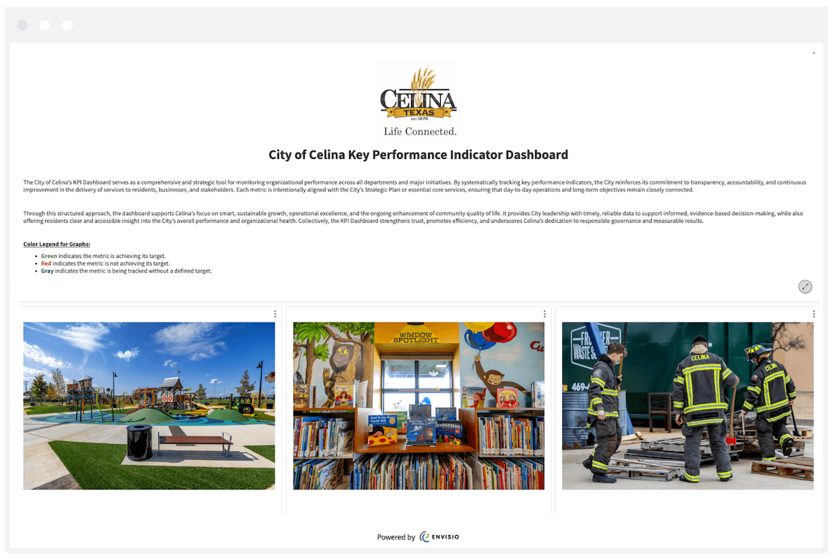
The City of Celina’s Key Performance Indicators Dashboard reflects the city’s “Life Connected” strategic mission. Like Jasper, Celina is also managing the reality of being one of the fastest growing communities in the United States.
The dashboard is organized by department and tracks a mix of service delivery metrics, infrastructure health indicators, and community engagement data, with clear targets and plain-language explanations for each measure.
Development Services metrics focus on the speed and quality of the permitting process amid surging development activity:
- Average initial plan review time for commercial permits (target: 3 weeks)
- Percent of commercial plans approved within 3 submittals (target: 80%)
- Percent of code complaints responded to within 1 business day (target: 95% in Q1/Q2; 60% in Q3/Q4 due to high grass/weed complaint volume)
- Percent of code enforcement cases resolved through voluntary compliance (target: 85%)
Public Works tracks the health of Celina’s core infrastructure across streets, water, sewer, stormwater, and solid waste:
- Pavement Condition Index (PCI) average citywide score — currently 87, against a target of 80, boosted in part by developer-built roads
- Number of water service interruptions per quarter
Human Resources measures organizational health during a period of rapid staff expansion:
- Employee turnover rate on a rolling 12-month basis (target: 11%)
- Average number of days to fill vacant positions (target: 30 days)
Marketing & Communications tracks the city’s reach and engagement with its growing resident base:
- Subscribers to the resident newsletter (baseline being established)
- Total social media impressions across all channels
- Social media audience size, engagement rate, and video views
why we love it:
What makes Celina’s dashboard particularly readable is the narrative context behind each metric. Rather than presenting numbers in isolation, each KPI includes an explanation of what it measures, why it matters, and what the target is — making it equally useful for a department head managing daily operations and a resident trying to understand how their city is performing.
9. City of Bloomington, MN
Community size: 89,000 residents
Types of KPIs Measured: Community connection, inclusion, health and wellness, environmental sustainability, economic growth, housing, parks and recreation
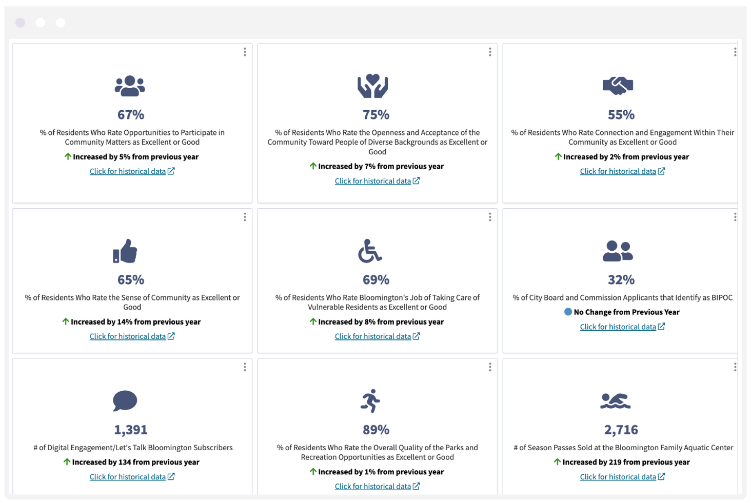
Bloomington’s Bloomington. Tomorrow. Together. (BTT) dashboard is built around a five-year strategic plan co-created with more than 400 community members, and organized into three dedicated performance analytics dashboards — one for each strategic priority. Each dashboard is updated annually and tracks a mix of resident satisfaction survey data and operational output metrics, with year-over-year trend indicators and historical data available for every measure.
A Connected, Welcoming Community tracks inclusion, civic participation, and quality of life:
- 75% of residents rate community openness toward people of diverse backgrounds as excellent or good (↑7%)
- 65% rate sense of community as excellent or good (↑14%)
- 67% rate opportunities to participate in community matters as excellent or good (↑5%)
- 32% of City Board and Commission applicants identify as BIPOC (no change)
- 1,391 digital engagement/Let’s Talk Bloomington subscribers (↑134)
- 89% rate overall parks and recreation opportunities as excellent or good (↑1%)
- 88% rate quality of parks as excellent or good (↑4%)
- 88% rate availability of paths and walking trails as excellent or good (↑6%)
- 2,716 season passes sold at Bloomington Family Aquatic Center (↑219)
A Healthy Community tracks environmental health, public health services, and sustainability programs:
- 92% of residents rate quality of drinking water as excellent or good (↑2%)
- 87% rate preservation of natural resources as excellent or good (↑11%)
- 75% rate overall health and wellness opportunities as excellent or good (no change)
- 77% rate availability of affordable quality food as excellent or good (↑12%)
- 200 trees planted; 645 households signed up for curbside organic recycling
- 347 households participating in the Home Energy Squad Program; 130 water rebates issued
- 1,204 family home visiting program visits completed (↓100)
- 3,090 WIC supplemental nutrition program participants (↓149)
- 1,075 flu shots and general immunizations administered (↑23)
A Community with Equitable Economic Growth tracks business activity, development quality, and resident perceptions of economic opportunity:
- 1,945 business licenses issued (↓183)
- 81% of residents rate Bloomington as a place to work as excellent or good (↑5%)
- 78% rate variety of businesses and service establishments as excellent or good (↑11%)
- 66% rate employment opportunities as excellent or good (↑8%)
- 61% rate overall quality of new development as excellent or good (↑6%)
- 52% rate well-planned economic growth as excellent or good (↓2%)
- 46% rate availability of affordable quality housing as excellent or good (↑9%)
Why we love it
We really like seeing the consistent use of resident perception data alongside output metrics: tracking not just what the city is doing, but how residents actually experience it. The year-over-year change indicators on every single measure create a living accountability record, making it easy to spot both momentum and areas needing attention.
—
The 9 performance analytics dashboards featured here span fast-growing desert cities, a small Southern county, and a high-density commercial corridor in Los Angeles. They track cardiac survival rates, resident satisfaction trends, and IT contractor cost avoidance. Every one of them is committed to making performance data meaningful, consistent, and public.
A few things stand out across the best examples on this list. The organizations that get the most out of their dashboards do the hard work upstream first: deciding what actually matters, building internal ownership of the data, and updating it on a real schedule.
The dashboard is the output, but the culture behind it is what makes it work.
The best dashboards on this list also show setbacks alongside wins. Corona reports homelessness metrics like shelter beds available and permanent housing placements right alongside calls for service. Bloomington’s economic dashboard reports that only 52% of residents rate well-planned economic growth as excellent or good. Las Cruces breaks its own progress data apart to show where real advancement is happening and where the numbers are propped up by a single initiative.
That honesty builds trust. It’s the difference between a KPI dashboard people glance at once and one they actually believe.
The principles hold across all 9 examples, whether you’re just getting started with performance measurement or strengthening a program you already run: measure what matters, explain what the data means, connect it to strategy, and put it in front of the public.
Download the Guide ↓
If you are ready to build your own performance analytics dashboard — and want a practical framework for choosing the right metrics — our guide is a good place to start.
Download: Measure What Matters Most →
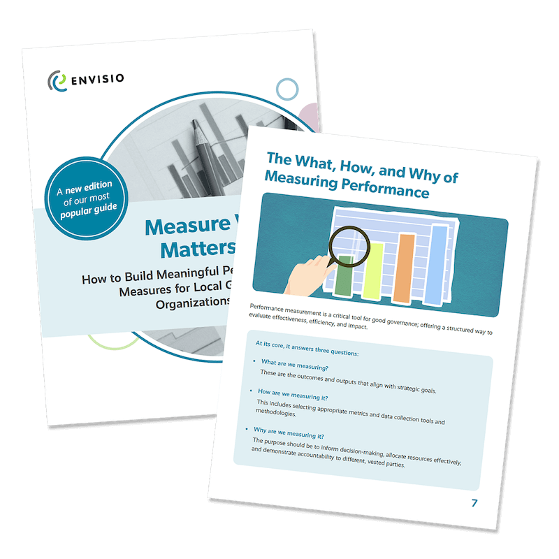
A step-by-step guide to developing the right performance measures for your city, county, or public organization — including real examples of local government KPIs across departments.