Contents
- Example 1: City of Minnetonka, MN – Strategic Profile & Community Dashboard
- Example 2: City of Irving, TX – Organizational Strategy Report Card and Dashboard
- Example 3: Washington County, OR – ARPA Dashboard
- Example 4: City of Bloomington, MN – Strategic Planning Dashboard
- Example 5: City of Brookings, SD— Insight Performance Dashboard
- Example 6: City of Rockville, MD – Climate Action Plan Dashboard
- Example 7: City of Woodbury, MN – Performance Measures Dashboard
- Example 8: City of West Hollywood, CA – Climate Action Dashboard
- Takeaways for Your Local Government Dashboard
- Local Government Dashboards in Action [VIDEO]
- View More Examples ↓
Summary
These eight local government public dashboard examples show how cities and counties use performance dashboards to transparently track strategic goals, funding, and outcomes while improving public trust and accountability. The strongest dashboards combine clear context, focused KPIs, and consistent updates to make complex government performance data easy for residents to understand.
- Dashboards should explain what the data means, not just show it.
- Fewer, well-chosen KPIs outperform large metric lists.
- Transparency includes showing setbacks and delays.
- Metrics and projects must clearly tie to strategy.
- Consistent updates build credibility.
- Simple, accessible design increases public use.
Having a publicly-available government dashboard is one the best ways that local governments can build trust with the community and elected officials while engaging employees.
But getting started can be daunting. In this post, we’ll share some of our favorite city and county government performance dashboards, and why we love them.
You’ll see that the very best local government dashboards tell a story. They make it easy for residents to understand how their city or county is progressing against set strategic goals and why those goals are important to improving lives in the community.
To make a performance dashboard meaningful, it should also be transparent about setbacks or missed targets, and be updated consistently.
We also know that producing a great performance dashboard is not just about choosing the right chart types or providing context for the data (although those things are critically important). It’s also about having the right processes in place to support the rigor and rhythm of regular performance reporting, and fostering an internal culture of transparency and engagement. With that in mind, we have included links throughout this post to learn more about how some of these local government teams set themselves up for success both culturally and technologically.
We hope these local government dashboard examples provide some inspiration as you plan out your own public dashboard or performance reporting framework.
One final note before we dive in… all Envisio-powered public dashboards shared here are interactive, and allow for the public to download data and other dashboard elements.
Let’s go.
Example 1: City of Minnetonka, MN – Strategic Profile & Community Dashboard
Community size: 53,266 residents
Dashboard maintained by: Communications and Marketing Team
The team at the City of Minnetonka is passionate about providing residents with a high level of transparency about the work they do. Their beautifully thought-out Strategic Profile & Community Dashboard is a testament to that passion, and to the level of engagement they have from staff at all levels; from directors to front-line managers.
Minnetonka’s interactive performance dashboard provides quarterly progress updates for all 3 levels of the city’s Strategic Profile. Website visitors can drill all the way down through the city’s 6 strategic pillars and 24 key strategies, to 90+ action steps.
The dashboard includes roughly 40 performance metrics, utilizing data from both residential survey results and from city departments. The city’s strategic pillars and key strategies are multi-year elements, but the action items in their plan, and on their dashboard, change from year to year (we highly recommend this approach as a way to keep your strategic plan a “living” plan and to align budget with strategy.)
The City of Minnetonka’s strategic profile dashboard is one of our absolute favorite local government dashboards. Not only is it helping city leaders to communicate progress against strategic city priorities, it also highlights the great work being done by city staff and helps to nurture a shared vision for the community.
And of all the local government dashboards powered by Envisio, Minnetonka’s Strategic Profile & Community Dashboard consistently ranks in the top 5 for most-visited dashboards. This reflects the city’s commitment and action towards promoting the dashboard and engaging residents.
Dashboard Key Takeaways
If that’s not enough, we also love the City of Minnetonka’s dashboard because:
- It seamlessly integrates written progress updates, a traffic-light progress indicator bar, and associated performance measures into one, drill-down dashboard. Combining qualitative and quantitative measures—and using different types of visuals to tell the performance story—provides a complete picture of performance as well as serving different communication styles.
- Every element of the dashboard has been thoughtfully built; from the layout that supports a natural information hierarchy, to the selective use of performance measures and visualizations to support progress updates written by staff.
- The high level of staff buy-in with the strategic plan and the reporting process is reflected in the quality and completeness of the updates provided. The public dashboard is updated consistently every quarter and outlines the city’s successes as well as disruptions. Transparency is at the forefront.
- The dashboard has a prominent place on the City of Minnetonka website, sitting as the second menu option under the Our City menu.
- The dashboard is available in over 20 languages thanks to a simple drop-down translation menu.
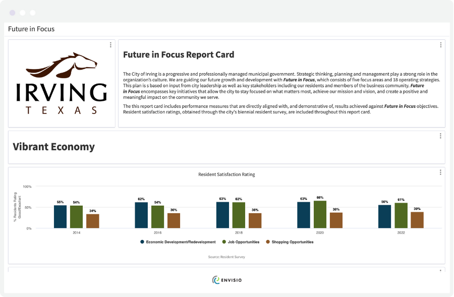
Example 2: City of Irving, TX – Organizational Strategy Report Card and Dashboard
Community size: 254,198 residents
Dashboard maintained by: Innovation and Performance Office
The City of Irving is an exceptionally high-performing local government. In 2012, the city won the Malcolm Baldrige National Quality Award, becoming only the second municipal award recipient in the program’s 25-year history.Today, the Innovation and Performance Office at Irving continues to earn a reputation for local government performance excellence with strong data management, a culture of continuous improvement and a commitment to public transparency.
In 2021, the city achieved the What Works Cities Silver certification, and is tracking progress towards an even higher level of certification in future.When it comes to measuring progress against the city’s five strategic focus areas and 18 operating strategies, the Irving team provides two performance dashboards to show progress against their Future in Focus strategic plans. Future in Focus serves as the city’s operational strategic plan framework and the framework within which all city services are delivered. It aligns with the city’s 5-year capital plans, Council priorities, and annual budget.
The two performance dashboards are: Future in Focus Strategy Dashboard which shares both status updates and key performance data to show progress against the Future in Focus strategic initiatives, and the Future in Focus Report Card which provides more comprehensive data that aligns with the plan goals, as set by Council, city leadership, residents, and other members of the Irving community. Both performance dashboards are excellent—and together they provide a well-rounded view of the city’s performance and progress against their strategic plans—but we particularly love the Report Card.
Dashboard Key Takeaways
Here’s why we love the City of Irving’s Report Card dashboard:
- The dashboard and each set of charts is clearly organized by the strategic pillars outlined in the city’s Future in Focus strategic plan (Vibrant Economy, Infrastructure Investment, Sense of Community, Government Sustainability, and Safe and Beautiful City). It’s easy to cross-reference these measures with the strategy dashboard and get a complete picture of performance.
- There are clear and detailed descriptions for each set of charts. These descriptions explain what the measures are, and why improved performance against these measures contributes to a higher quality of life for residents.
- The data visualizations are varied but applied appropriately to tell a clear story of performance in each area. Visualizations include maps, scorecard visuals, line and column charts, and target lines where appropriate.
- Residents can download each chart as an image file, a PDF, or export the raw data as a spreadsheet.
- The report card dashboard includes some benchmarking data, where appropriate, to show how the City of Irving is performing against national standards, as well as budget data on some Capital projects. The City of Irving is leading the way in terms of transparency with their community.
- The Report Card can be accessed from a page on the City of Irving website that includes details about the city’s strategic planning process, previous years’ results, and contact details for the Innovation and Performance Office team.
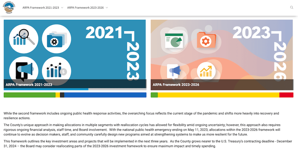
Example 3: Washington County, OR – ARPA Dashboard
Community size: 600,811 residents
Dashboard maintained by: American Rescue Plan Act (ARPA) Program Team
In March 2011, the federal government passed the American Rescue Plan Act (ARPA) allocating billions of dollars to support state, local, tribal, and territorial governments in recovering and responding to the impacts of the COVID-19 pandemic. Special emphasis was placed on addressing deepening inequities and the disproportionate impact of the pandemic on marginalized communities. Transparency in how governments used the funds allocated to them was another core theme of the Act.
In this spirit of transparency, and to help with meeting federal reporting requirements in some cases, many of our local government customers created ARPA dashboards to track the distribution of these funds. However, the team at Washington County has created one of our favorites.
With $117 million advanced to the county in two tranches, the team at Washington County has created a beautiful ARPA framework dashboard to track the use and outcomes of this once-in-a-generation funding.As well as ensuring public transparency, this local government dashboard is one piece that is helping the county go “from being data curious to fully embracing data-informed decision-making.”
Dashboard Key Takeaways
Here’s why we love Washington County’s ARPA dashboard:
- The dashboard homepage provides a legend so residents can easily understand the traffic light progress bars used throughout the dashboard. The homepage also includes Washington County’s ARPA investment principles.
- The County’s ARPA projects are complex and diverse; spanning outbreak response to vaccination to small business support to broadband investment. However, the dashboard feels simple to navigate, with lots of explanation of the projects underway, and unique and clear data visualizations.
- It’s a beautiful local government dashboard. The team uses eye-catching, custom imagery to make each level of the dashboard engaging, aligned with the County’s brand, and contextual.
- The dashboard actually covers two plans for spending ARPA money in the two tranches by which the funds have been released. The County has been smart to keep both plans (2021-2023 and 2023-2026) on the same interactive dashboard to provide a complete history of how the County has used this funding to the benefit of the community.
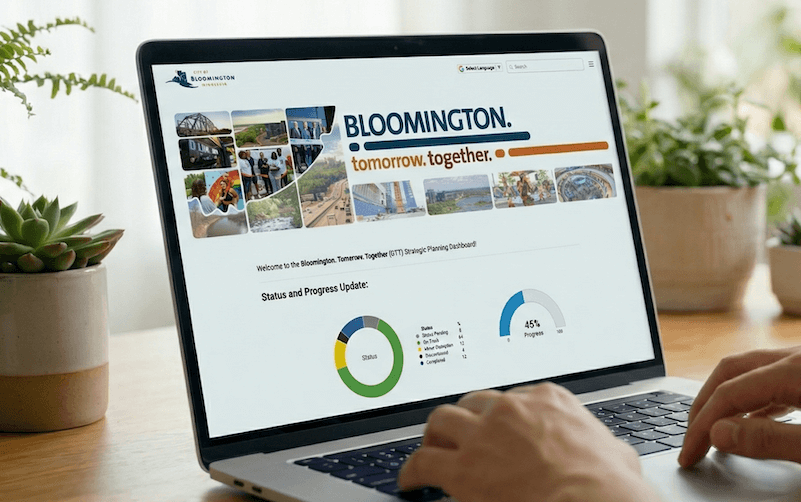
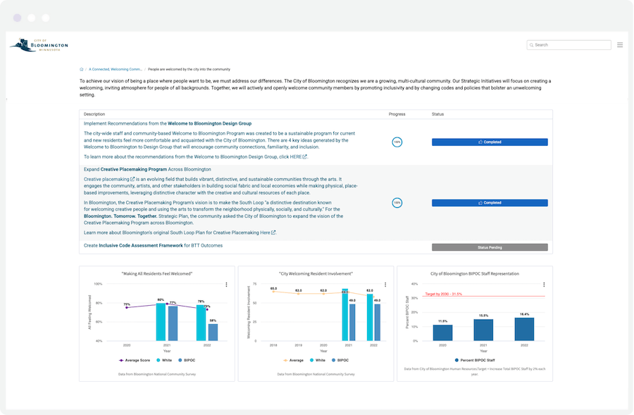
Example 4: City of Bloomington, MN – Strategic Planning Dashboard
Community size: 89,987 residents
Dashboard maintained by: City Manager’s Office
The Bloomington. Tomorrow. Together. dashboard tracks the city’s work and progress made towards the outcomes and targets identified in their strategic plan.
Bloomington’s strategic plan was co-created with residents alongside representatives of the city–including more than 400 community voices. Their performance dashboard is structured around the three strategic priorities identified through that collaborative effort:
- A connected, welcoming community
- A healthy community
- A community with equitable growth
Each one of these pillars breaks down further into three strategies. Visitors can get a high level overview of the strategic priorities and then click down through all levels of the plan for more detail on the actions, performance measures, targets, and progress against each priority.
Dashboard Key Takeaways
Here are just some of the reasons we love Bloomington’s strategic plan dashboard:
- It feels simple. The city has done an exceptional job of narrowing down the city’s strategic priorities to three core priorities. The language and concepts are easy to follow and, by keeping the priorities and associated strategies to a minimum, the dashboard feels simple to navigate and compelling to explore.
- The homepage of the dashboard is full of rich information to help the visitor understand why the plan exists, how it was created, and the Vision, Mission, and Values that underpin it. The dashboard homepage includes a video, the city’s mission statement, a link to the strategic plan, and a legend explaining the dashboard color-coding system.
- The performance measures are not overwhelming in number and include outcomes data (such as survey data showing the percentage of people who scored the city highly on ‘making all residents feel welcomed’) as well as outputs data (such as Number of Creative Placemaking projects completed). Most of the charts have clear target lines to quickly and easily communicate how the city is doing against its goals.
- There is a clear communication of when and how often the dashboard will be updated, as well as recognition that the strategic plan and dashboard are “living” pieces of content that evolve over time. As a result, status and progress indicators will fluctuate as new work is added or, potentially, discontinued.
It’s clear how much thought and care has gone into the creation of Bloomington’s community-based strategic plan and their performance dashboard.
“As a staff person, I think it’ll be really helpful for just having an understanding across the organization of how things are changing — where our focus is turning in the next several years. It puts everybody on the same page because we can track it together.”
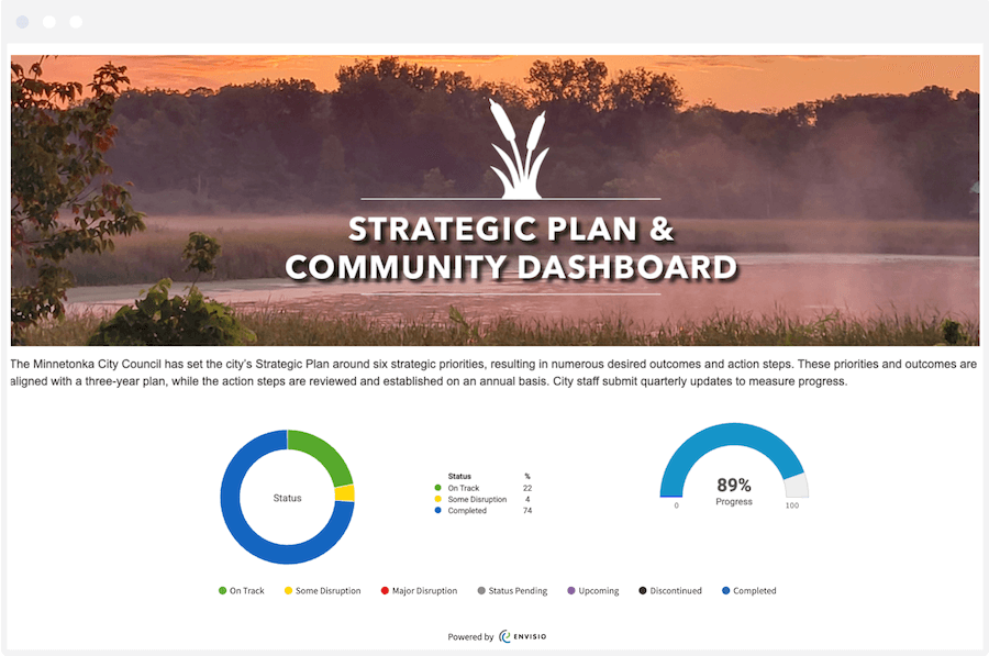
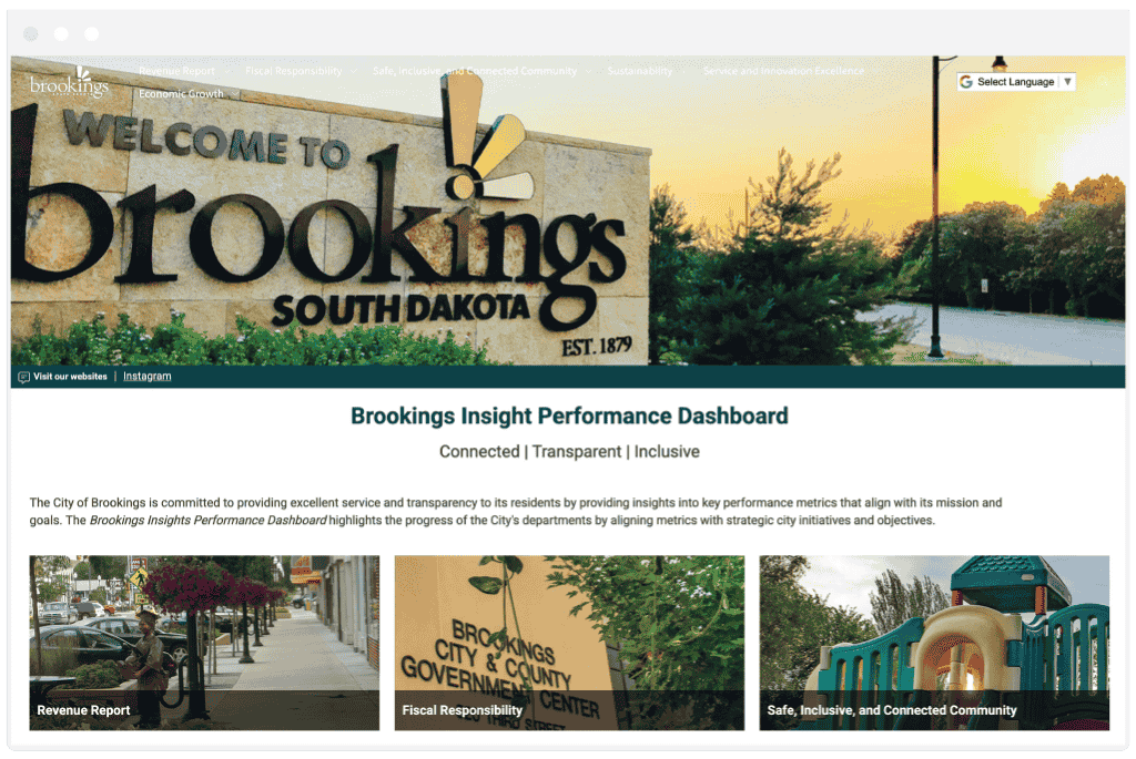
Example 5: City of Brookings, SD— Insight Performance Dashboard
Community size: 23,377 residents
Dashboard maintained by: City Manager’s Office
Using the Brookings Insight Performance Dashboard, the City of Brookings highlights KPIs from across multiple local governments departments, which show residents how the city is progressing toward its mission of providing high-quality services and enhancing community well-being.
This excellent example of a public-facing government dashboard provides clear insights into key performance indicators (KPIs) aligned with strategic initiatives within five focus areas:
- Fiscal Responsibility
- Safe, Inclusive, and Connected Community
- Sustainability
- Service and Innovation Excellence
- Economic Growth
Rather than simply presenting raw data, each chart on the dashboard includes a description providing context and an analysis for each metric that explains historical trends, regional benchmarking where relevant, and the broader impact of the data. This approach transforms simple numbers into insights, making it easier for community members to understand how the city is performing.
Dashboard Key Takeaways
- Each metric is supported by a clear description, visualization, and in-depth analysis that provide meaningful insights rather than just numbers.
- The dashboard makes excellent use of drop-down navigation menus to reduce clicks and improve usability. Dashboard visitors can use the drop-down menus to quickly navigate to a specific performance measure underneath each strategic focus area.
- Each of the five focus areas on the dashboard has a number of charts, but also provides a description of significant accomplishment and highlights. The most effective dashboards for informing residents provide a combination of narrative and data updates. The City of Brookings’ dashboard does a great job of this.
- It feels simple. The whole dashboard feels clean, aesthetically compelling, and easy to navigate. The narrative updates are easy to read and the charts are not overly complex. This is a great example of a resident-friendly interactive dashboard.
- It’s rare to see local government dashboards that include fiscal responsibility information. It’s great to see the city sharing details of their debt-to-revenue ratio target and bond rating.
Brookings Insight is setting a high bar for municipal performance measurement by prioritizing data-driven decision-making and public transparency.
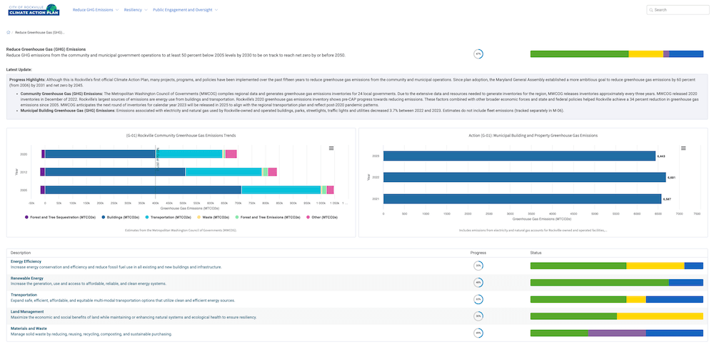
Example 6: City of Rockville, MD – Climate Action Plan Dashboard
Community size: 67,297 residents
Dashboard maintained by: City Management Office
The City of Rockville’s first Climate Action Plan (CAP) was adopted on January 10, 2022. This ambitious plan features a combination of mitigation and adaptation goals and aims to reduce greenhouse gas emissions by at least 50% by 2030.
The city’s Climate Action Plan dashboard shows how the city is tracking against these strategic goals. Comprising 50 actions that roll up to three strategic pillars, Rockville’s climate performance story is told through both the numbers and narrative updates. The Rockville team does an exceptional job of using charts on their dashboard sparingly and providing lots of rich context for the numbers.
As well as improving community transparency, the city’s other goals behind launching a public-facing dashboard include improving the effectiveness of the city through a clearer understanding of strategic outcomes and progress and to reduce the workload of staff in creating reports for elected officials and residents.
Dashboard Key Takeaways
Of all the local government dashboards powered by Envisio, Rockville’s dashboards is firmly on our favorites list because:
- It is deceptively simple. The dashboard has just three strategic pillars covering Greenhouse Gas Emissions, Resiliency, and Public Engagement. The imagery used for each strategic area is relevant and engaging.
- The charts are beautifully put together and sparingly used. Each chart has a clear description which includes information on the source of the data. The associated written progress updates provide additional details about the performance measures, including how to interpret the data and any other relevant information. Each chart tells a story.
- The use of highly contrasting and vibrant colors makes the charts engaging, accessible, and easy to read.
- The data behind each performance measure can be downloaded from within each individual chart on the dashboard.
- Written progress updates from staff are comprehensive and broken out into sections titled “highlights”, “next steps”, “metrics” and – where relevant – what considerations have been made around equity and where grant funding is available or in use. Rockville follows best practices in terms of providing staff with a template for their narrative dashboard updates, which helps them create more complete updates that are easier to digest as a dashboard visitor.
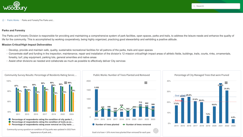
Example 7: City of Woodbury, MN – Performance Measures Dashboard
Community size: 76,990 residents
Dashboard maintained by: City Manager’s Office
The City of Woodbury is another high-performing city in Minnesota. Since 2009, the City’s performance measurement program has been recognized for excellence by the ICMA, including being awarded a Certificate of Excellence for Performance Management by the International City/County Management Association’s Center for Performance Management (ICMA-CPM) in 2021 (there was no 2022, 2023 or 2024 award available from the ICMA). This is the highest award level from the ICMA-CPMA, recognizing local government programs that instill a culture of performance management, comparative analysis, data-informed decision-making and transparency.
Woodbury’s public performance measurement dashboard is a little different to the previous dashboards in that it is organized by department and updated annually. Each section of the dashboard provides the key performance indicators and statistics used to measure departmental success. The dashboard also includes a separate section with a subset of the key performance indicators from the rest of the city’s dashboard. These are the KPIs that relate to the city’s strategic initiatives or are considered critical to the city’s success more broadly. It acts as a summary of the most critical performance measures and provides a great one-stop-shop for dashboard visitors that are looking for a quick overview of the city’s performance measurement program.
A departmental performance measurement dashboard is a great option for municipalities that don’t have a strategic plan but want to be transparent with their communities about organizational performance.
Dashboard Key Takeaways
We love Woodbury’s performance measurement dashboard because:
- Each section of the dashboard has a clear description of the associated department and the services it is responsible for delivering.
- Each chart has a written description of what and how the data is collected. Data collection includes community surveying, where appropriate.
- Excellent chart design choices make it easy to see exactly how the city is performing against each measure. Many of the charts include a target line to show the performance goal, and most of the charts include an average line to indicate the data average across the charted time period.
- Providing a summary section with a subset of the most critical performance measures is a great addition to a government dashboard. It is a quick and easily consumable section, without any drill-down options, and can help visitors quickly get a sense of how the city is performing in key areas.
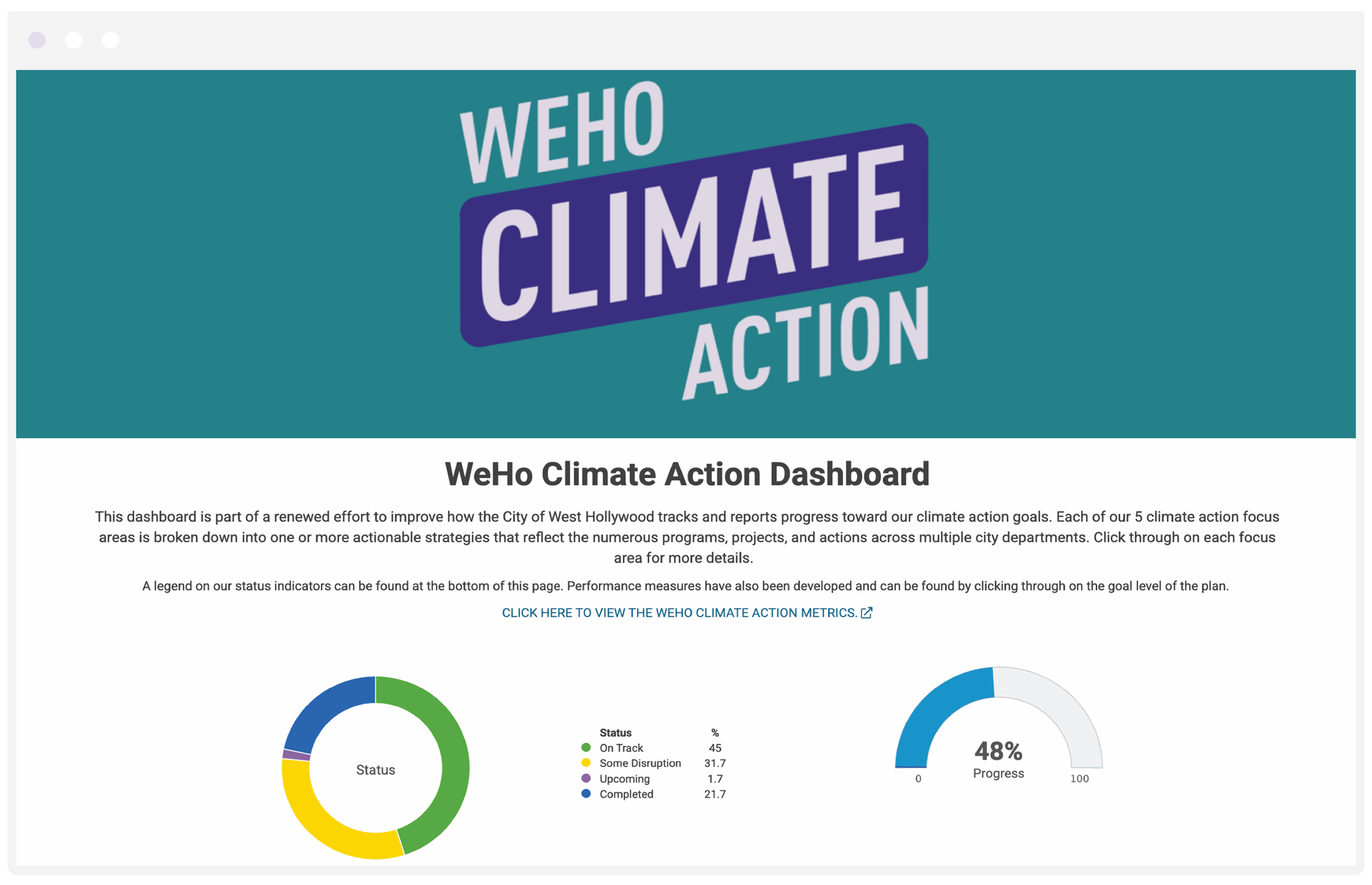
Example 8: City of West Hollywood, CA – Climate Action Dashboard
Community size: 34,938 residents
Dashboard maintained by: Long Range Planning Team
The City of West Hollywood’s 2021 Climate Action and Adaptation Plan looks to advance the city’s progressive green policies and introduce aggressive climate action targets. The plan “outlines the City’s intended path to achieve carbon neutrality by 2035 and adapt to the impacts of a changing climate while centering equity and quality-of-life outcomes for the West Hollywood community.”
The City of West Hollywood (WeHo) Climate Action dashboard is part of the city’s efforts to measure, track, and share the progress made towards these climate goals in a way that is simple for residents to understand, transparent, and easy to navigate.
The dashboard displays 5 strategic focus areas, which are then broken down into a number of strategies and actions.
As we see a sharp rise in the number of local government climate action dashboards being published by our customers, we believe that WeHo’s is one of the best.
Dashboard Key Takeaways
Here’s why we believe the City of West Hollywood has one of the best examples of a climate action dashboard:
- It feels simple and easy to navigate. There are many supplemental materials offered for each focus area, including information on the city’s programs and initiatives in each area, advice for residents facing the impacts of climate change, and some of the city’s accomplishments in sustainability to date.
- The city is transparent about progress made towards each strategy, including both written updates and key performance measures.
- Written updates are thorough and detailed, but well grouped into sections (Status, Next Steps, Issues, etc.) to make it easy for residents to find key insights.
- The dashboard is embedded directly into a page on the city’s website so visitors can stay on the main website as they explore the dashboard.
- WeHo’s dashboard includes a multilingual drop-down and a dashboard search option for easy navigation.
WeHo’s Climate Action dashboard includes so many of the things we love to see in a local government public dashboard, including a clear legend explaining progress indicators, lots of context, supplemental information for visitors who want to learn more, and a named point of contact for residents who may have questions.
All of which leads us to…
Takeaways for Your Local Government Dashboard
The very best local government dashboards follow some clear best practices. As you plan out your own performance dashboard, we recommend you:
- Include a point of contact for residents who may have questions or feedback on your dashboard.
- Provide as much context as you can about your dashboard, why it’s important, and how to use it. Consider adding a video and your community vision statement to your dashboard homepage.
- Use a combination of qualitative and quantitative data to tell the most complete story of organizational performance.
- When using charts, add descriptions of where the data comes from, and how to interpret the results. Use highly contrasting colors when comparing different data categories.
- Update your dashboard consistently and regularly (in most cases, we recommend quarterly).
- Be transparent about performance. The excellent, the good, and the disrupted.
- Provide a multilingual drop-down option to translate the dashboard into different languages and support accessibility for all community members.
- Make it easy for your website visitors to find your dashboard in the first place. Give it a prominent place in your website navigation, and have a plan to promote it!
Local Government Dashboards in Action [VIDEO]
Launching a public dashboard is an excellent way to build trust; not just with residents, but also with elected officials. This 2-minute video showcases four cities presenting their Envisio-powered performance dashboards to their city councils.
If you would like to learn more about launching a local government performance dashboard, we’re here to help. We work with over 200 local governments across North America, and many of them use an Envisio-powered performance dashboard to provide greater transparency and accountability to residents.
The good news is that if you are already tracking plans and performance in Envisio, setting up a public-facing dashboard to show your progress is a simple process. You can learn more about our community dashboards here or just give us a call.
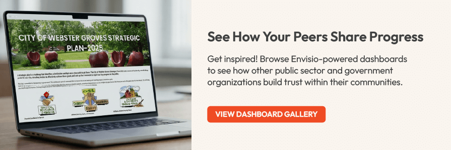
View More Examples ↓
Feeling inspired? Visit our Inspiration Gallery to explore dozens more examples of local government dashboards – from mobility plans, to housing initiatives, to capital projects and much more.